
Nobody creates tacky signage on purpose, but yet somehow we see it everywhere, regardless of the digital or traditional variant. Understanding what it is that makes your signage tacky can help to avoid it. You should try your hardest to do so because even though tacky signage succeeds at drawing attention to itself, it’s the kind of attention you don’t want!
Keep the message simple
You’ve seen this tip everywhere, but that’s only because it’s so important! Whether it’s digital signage or a traditional billboard, the message must be simple and easy to understand. With more complex signage that’s very creative, there needs to be a lot of strategy and thought put into to make it work. Such complex campaigns do pay off, if done well, but applying so much effort and hoping it works out isn’t recommended for all your campaigns.
For most of your signage efforts, if you want the greatest chance for success, keep the goal of your message simple. This typically refers to product placements, sales, event information, etc. These are things where you don’t need to be extra creative. You just want to get the message across. Unless you’re creating a philosophical piece you want to see go viral on social media, go for a direct one-note goal.
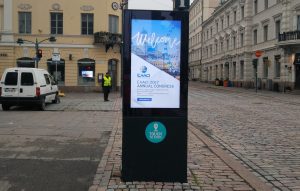
In case you do need to include additional information, prioritize! Place the main information at the forefront. In the example above, you can see that the intricate detail is minimized, so only people actually interested in the event will approach and read on. But it doesn’t take away from the main message which states that an event is taking place.
Avoid text as much as possible
It’s true. Most of the time, it’s impossible to eliminate all text and still retain a message. Still this is a good impossible goal to strive towards. The greatest guideline to avoid tacky signage is to minimize the number of words on it and choose your words carefully. Dissect each sentence and find the shortest, most accurate words you can. The ideal signage would be able to deliver the message through an image or statement that is instantaneously absorbed by the viewer. Words upon words create clutter. And by striving towards this goal, you might discover that you can communicate your message through a single word, or no words at all.
The perfect example of an ad that works through this simplicity is Nike’s “Just Do It.” Three words, but one could spend sentences describing the meaning behind them.
Place signage carefully
The location of your signage is key, because it can make or break your signage. The placement should be such that it actually enhances the surroundings. Here’s an example of a billboard from Poland which enhanced its surroundings only after it was removed!

It’s safe to say that, no matter how good the ad is, it could never look good in this location! The first thought that comes to mind is that it’s blocking several windows. Then there is the strange angle of placement which makes no sense. The importance of placement applies to smaller signage too, such as within your store or at the storefront.
You shouldn’t place signage anywhere in your store where it might obscure the view of something, be in the way, or just look ill fitting. This factor is so important because it has the potential to destroy a perfectly designed piece of signage.
Take a look at some more examples of bad signage placement, for inspiration!
Strengthen your call to action
All signage in the world aims to get the viewer to do something. This can be as simple as raising awareness of an issue, or as complex as performing a series of tasks. The key to achieving that goal is a strong call to action. Otherwise, it’s just a sign that’s just… there.
Any good call to action accurately and clearly presents what you want the viewer to do. Choose direct and active words in your call to action. Don’t instruct. Command!
“Shop now! Follow us on Instagram! Save 30%!” These are compelling commands and get people to respond. You should also use trigger words that make people pause and think. Words like free, easy, new, are by now associated with storefronts, and people know what they’re saying. “75% off!” says it all. You don’t need to add anything to it. Trigger words bypass the long sentences we mentioned earlier, and communicate faster and with greater accuracy. Find more tips on creating a good call to action over at Sixteen:Nine.
Diversify your content
Diversity is quintessential for good digital signage. Stale and repetitive signage is relatively acceptable when it comes to traditional billboards. After all, they don’t have the ability to change quickly. Digital signage has that ability, and it is why it is held to a higher standard. Stale and repetitive content is unacceptable on digital displays, but this issue is quite easy to fix.
Creating quality content requires effort on your part, but digital signage software can do most of the work for you. Apart from scheduling the content to rotate in complex patterns, software can help you create content from scratch or supported by templates. For instance, OnSign TV offers the ability to create your own data feeds which enables you to take information from a spreadsheet and pour it into an app. So all you need is the raw data regarding product pricing, birthdays, event schedules, or interesting facts, to name a few. The software does the rest and presents it through an app of your choosing to make it visually appealing. This is a great way to diversify your content rotations.
Experiment with data feeds right away through OnSign TV, for free!


