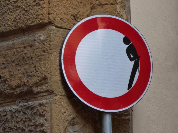
Is there room for humor in the Out-of-Home world? Some businesses might not find it an effective tool in engaging their audience. Others might be afraid of coming across as not behaving business appropriately. Overall, anecdotal evidence indicates that most outdoor advertising doesn’t rely on humor to deliver their message.
Of course, while this might be discouraging to some, to others it means there’s that much of an opportunity to stand out in the crowd! Let’s discuss the potential of humor, as well as some guidelines on ensuring you use it to the best of your abilities.
Humor in Out-of-Home makes an impact
Humor is a powerful ingredient among your content mix elements because it’s memorable. If a message makes people chuckle or smile, they will remember it for a little while longer and likely share it with others. This is because they won’t look at the content as an advertisement but rather as entertainment.
Another reason humor makes an impact is because most ads do not contain it. A funny outdoor ad is a rare find! Of course, there are those that do use humor, but proportionally based on the number of ads a regular person sees daily, most of them aren’t trying to be funny. Thus, coming across an ad which does deliver a punchline will be a memorable experience.
Don’t rely on an old joke
When it comes to funny ads or campaigns, there are some rules of thumb to keep in mind. Firstly, it’s not a comedy show, so you shouldn’t just latch on to the funniest joke you know and stamp your brand name across it. That’s not the point!
The best guideline—and the greatest challenge when creating a humorous ad—is to ensure it’s not funny without your brand. If you manage to create an ad that cannot be told without mentioning your brand or the services you offer, congratulations! You’ve hit the nail right on the head. The image above is a perfect example as it involves the business, makes sense, and has multiple meanings ideal for the context.
Reach a wide audience
Another challenge for you is to create a humorous ad which is entertaining to as wide an audience as you can reach. Everyone has a unique sense of humor making it tricky to find the middle ground where everyone chuckles at the joke. Still, don’t let that discourage you. It is inevitable that some people might find humor in Out-of-Home ads to be “trying too hard” or that they’re cheesy. That is totally acceptable! People have opinions. Being cheesy to a few people is not something to lose sleep over.
On the other hand, what truly can be problematic is an ad which can potentially make someone uncomfortable or deliver a message you didn’t intend to send. Take a look at the example above. Revolut’s ad says “To the 12,750 people who ordered a single takeaway on Valentine’s Day. You ok, hun?”
This ad above has a note of humor in it, no doubt about it, but the fact that it’s an advertisement from a bank made people think twice about its contents. Firstly, critics described the language in the ad as patronizing and “single-shaming.” But a bigger concern was the way the bank pried into the spending of its clients and exploited it for an ad. Thus, we can learn that just because a remark might have a humorous tone, it doesn’t necessarily mean it belongs on an ad for everyone to see.
How to tell the perfect OOH joke?
A good joke or a clever punchline is all about the delivery. When physically telling a joke to another person, we are mindful of our body language, tone of voice, and highlighting the right words. When it comes to an outdoor ad, this is no different. These same elements are present, but in a different form! It’s all about choosing the right words, visually highlighting the punchline, and being aware of the ad location. Not to mention, your humorous message should be short and understandable at a single glance.
An ad you might have seen before, the The Grinch ad has all the elements of a funny OOH message. The text is short and easy to understand at a glance. The ad location is perfect: right next to the ticket line. Another example of great placement was a second ad for The Grinch, placed at a traffic light, poking fun at those waiting for the light to turn green.
Use humor wisely
Humor can be a powerful tool, but be careful about how you use it. It only works if it’s insightful, smart, and well thought out. It’s a very unique and potent ingredient in your content, so don’t put it in each campaign or try to make each ad at least slightly humorous. Instead, create a healthy contrast in your content. It will make your messaging more effective overall. Keep most of your content on the serious and informative side, and only use humor in Out-of-Home content to deliver a really strong punchline and make your audience pause and take it in. Think of it as a rare treat.
As we mentioned, in outdoor advertising, ad design is the body language of humor. Digital signage software like OnSign TV allows you to experiment with content creation. For instance, you can use compositions to shuffle around text, images, and experiment with styles without ever leaving the platform. And that’s only one feature you can use in your content creation endeavors. Explore them all with a free 14-day trial, no credit card required!


