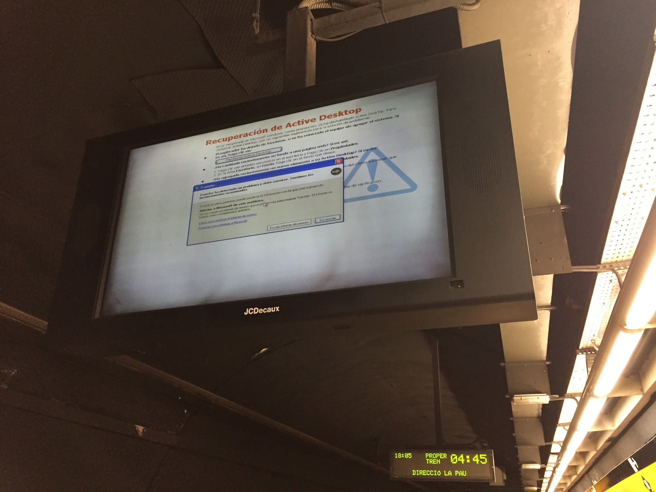
There is an entire family of mistakes made in digital signage. Some can be overlooked but there are several key mistakes that guarantee the failure of your digital signage.
You have an idea for a product or a service, and a few technical errors may prevent you from sharing them with the world. Let’s eliminate them, shall we?
#1 Wrong emphasis
You have to judge a new book by its cover because you have no clue what’s inside! Digital signage is the cover, your product is the novel. You want to ignite the interest of your audience, not bore them and you should only point out the most important information.
There’s a good chance you saw the word above before you read this sentence. This is the perfect example of how the wrong emphasis can destroy the structure of your message. Now imagine if I wrote ten more words like that and added a spinning logo. If the viewer feels like merely looking at your display will burn calories, they will probably keep walking because they don’t know where to look. There’s a thing to be said for the physical appearance of the sentence. You may have written a glorious novel, but it’s pretty pointless to try to sell it if your cover looks dull. This concept applies perfectly to digital signage.
#2 Information overload
You don’t actually have to send out every idea you have over digital signage. The content should be easy to digest with the least amount of time. Every second of attention you get is important and you have to use it wisely.
Cut out as many unnecessary words you can without losing the point you’re trying to make. In essence you should assume that the viewer’s attention will vanish every second. A single glance should be enough, the rest is really there for entertainment.
Digital signage is not television! There are actually moments when I see an amazing advertisement, but I end up wondering just what the heck it’s for. Long and definitely confusing commercials like this one are perhaps an interesting thing to observe at home, because you have time to wait for the message, but in a public place they won’t have much effect. In this case we can equate digital signage to make-up. Less is more!
https://www.youtube.com/watch?v=NewiSNS-vLk
„Getting information off the internet is like taking a drink from a fire hydrant.“
Mitch Kapor, founder of Lotus Software
#3 Overdoing it
Details are good in moderation, but for example if you plan on using audio, don’t think it’s a definite plus. It can actually destroy your digital signage completely. Audio should be used as a complement to video or images, not so much as the main attraction. Public being what it is, audio is frequently numbed out by noise. The digital signage should always be able to send the message across without sound, that way in case something does happen to the audio, the advertisement is still successful.
This also applies to color, logos, text etc. There is a certain balance where they’re most appealing. For example color can increase brand recognition by 80%, if used properly of course. For a more in-depth analysis check out this article.
#4 Not knowing your technology
The purpose of saving money from one thing is to be able to spend it on another thing. This demands you to handle your money wisely and not waste it on getting the wrong equipment. Get familiar with both your hardware and software and just how flexible they are with other technologies.
One of the issues in digital signage is compatibility. People often get the best quality software and hardware only to learn the two are incompatible. Incompatibility will attract attention but for all the wrong reasons.
Knowing your technology is most important when you’re trying to expand across multiple platforms. You need to take things like quality, loading time and compatibility to adapt your message quickly and easily across multiple platforms.
“These requirements will constantly need to be evaluated as technology and approaches to content design evolve over time,” says Thomas Kunka, a specialist at the University of Illinois. To read what digital signage experts have to say on the subject of expansion across media platforms check out this article.
#5 Location, location, location!
Put yourself in the shoes of your viewers and try to see how your digital signage will be perceived by an audience based on location. If your area is a public one, say a crowded street, you will literally depend on a few seconds to show your message.
When I’m walking to class or work I have my headphones on and like most people in the street my attention is divided. When an ad appears it has a few seconds to tell me what it wants, otherwise I will carry on not receiving the message. I will most definitely not stop, remove my headphones and wait patiently for it to be over, which is what you shouldn’t expect from your audience (unless they have ADHD). Longer messages are more appropriate in a place where the audience has time to process them.
Assuming people don’t actually leave their house in search of digital signage, you will do best if you make it as appealing as possible. Objective opinion is your friend and the shoes of your audience should be the only kind you wear! Metaphorically of course.
Images by: Opensource.com


