
Motion graphics and video elements can make your digital signage content appear more dynamic, engaging, and effective at delivering the intended message. The obvious route is to create videos which tell engaging stories. But utilizing movement in more subtle ways can transform static elements into something more exciting. We’ll explore the best ways to incorporate motion graphics in digital signage, the contexts where they work best, and methods on using them to maximize the impact of your content. Let’s begin!
Motion graphics in digital signage
When we talk about motion graphics in the context of digital signage, we’re talking about animated visual elements used to convey information, draw attention, or enhance the message of your brand.
This can include dynamic text, transitions between different content elements, animated icons, content frames, and even video elements on their own. Their number one benefit is catching attention and raising the chances a viewer will engage with the content in front of them.
Ideal areas for motion graphics in digital signage
Motion graphics enhance digital signage by capturing attention and improving engagement. As such, high-traffic areas are the first obvious location for their use. In a busy street, where your storefront is competing for attention, a catchy transition between slides can quickly tug on the view of passers by.
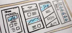
Motion graphics are also useful as sleek additions to elevate the style of your content. Gentle animations of content borders and transitions can give a more professional effect. Digital signage software typically incorporates these transitions within apps. Below you can see a quick preview of our weather app as it rotates through data sets.
In larger data sets, such as menu boards, animations can act as visual teasers for specials, or interactive buttons can provide additional information. This sort of highlighting is also important in internal uses where you may want to highlight a key element of a detailed graph or chart.
Maintain a simple approach
Animations serve a purpose. They can either be for style, highlight noteworthy parts of the screens, or provide direct instructions on interactive displays. As such, there comes a point where excessive use of animation defeats the initial purpose. For example, if half of the menu items are highlighted with a flashy border, the entire menu might as well be.
As the need for additional animated graphics rises, we want to maintain a healthy balance to ensure clarity. If additional highlighting is required, the animation itself needs to become more subtle. Another idea is to avoid content becoming animated simultaneously, and instead let them each shine one at a time.
Build your content style
If you’re using animated graphics purely for a stylistic choice, use it tastefully and in moderation. Apart from smooth transitions, provide only gentle accents to content frames and be consistent in which elements you choose to animate. Use matching color themes, not only for your highlights, but also your content as a whole. This consistency will help build the visual style of your brand, and make all your displays look professional. Not at all unlike the branding and style you would apply to your website.
Be mindful of content looping, and ensure that the content elements you choose don’t become dull and tiresome quickly. A flashy transition may look exciting the first two or three times it happens, but it quickly becomes a waste of time for the viewer. Simple transitions, such as slides, fades, or cross-fades into the brand logo for a split second, are always safe choices.
Another use for motion is to create content overlays. These are highly dependent on context, so don’t just randomly use anything you come across. An excellent example are subtle rays of sunlight in the corner of the screen, or a gentle wave of snowflakes flying across the screen.
Keep performance in mind
Animated graphics and videos are excellent additions to your content. But be mindful when using multiple visual elements at once. You may not realize how much you demand of your players if you use several graphic elements simultaneously. Therefore, be sure to test them and ensure everything can run smoothly. We’ve all seen tacky animations and laggy visuals time and time again. It’s the fastest way to destroy any semblance of style, and at times usefulness, of your content.
Test and adapt! Not only on the hardware side of things, but also the content itself. Keep testing different animations and styles until you find what works. Keep track of how often people engage with the visuals you highlight. Establish which style of animated graphics or videos get people to engage.
Digital signage software makes this entire process very easy. Apart from already having built-in visuals with apps, you can import your own videos and animations, and utilize them as part of your campaigns and compositions. As you continually expand your database of motion graphics, organizing them into a folder structure and creating templates makes future work that much easier. Give it a try, for free!
Cover image by Werclive.


