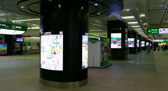
Aside from maximum illumination there are a few tricks you can use to make your digital signage shine and enhance your message. This is where the design comes in. It should convey your message successfully with ease and the least amount of confusion for the audience.
Words, not sentences!
Digital signage is perfect for conveying simple and straightforward messages, unless you’re relying on mind games, but that’s an entirely different story. The style and the size of the text should be visible from the distance, which is the main reason for simplicity. It also makes your message quick and understandable. Check out a few more tips on making your content more appealing in the eyes of the beholder.
Previewing the content
This is vital for the success of your digital signage advertising. Your design on a computer screen might look completely different from the final product on digital signage displays.
For instance: mixing fonts and using italics can make a message barely readable from a distance. Experimenting live is important in order to make sure your message is visible enough to be understood. Nobody has time to squint these days. Test it yourself from a distance and see what the first thing is that your eyes focus on. This is a perfect test to see if your elements are in order.
Much like with writing, music or video, at times we need an objective opinion simply because we’ve been observing something for far too long and it has a chance of clouding our judgment.
Red, Blue, Green!
If you had a proper art teacher when you were younger, you will know these are primary colors from which all other colors are derived from. From blue to red to green, the sensitivity of our eyes increases. Using vibrant colors and elements that attract the attention to the crucial parts of your message can be very helpful. You can also combine this with other features at your disposal.
Larger elements with more vibrant colors on your digital signage attract the eye of the viewer. However this won’t work if you slap a wall of green over your message, which is a note for caution. Don’t bombard the audience with color. But how many colors are too many? Here’s an interesting post about the use of fonts and color in digital signage.
Screens and colors
Colors can be a bit tricky in the digital world. Perhaps you noticed certain disclaimers on sites like Amazon or ebay saying that the color of the product may vary depending on the screen used to display them. Test to see what works best on your signage displays.
Amateur university presentations are perfect examples. I can’t tell you how many times I rolled my eyes when someone brought a presentation to class and once it’s projected we get a full view of utter darkness mixed with a deep blue. It’s nice that you can see the content on your laptop, but if the audience can’t see a thing it’s pretty pointless.
Simple combinations work best, black and white and perhaps a simple image, or singular colors but if your creation is more complex, test it to make sure your screens don’t make your artwork look like rainbow vomit.
Images with text
Depending on your content you don’t necessarily have to fully rely on text. Visual thinking is a lot faster than reading, which is why images and video are common tools in digital signage. Keep in mind that images and visual effects are there to complement the text and the message, not make them additionally confusing.
In the end it all comes down to the context. At some points, some elements work better than others. Depending on what your message is and what you’re using digital signage for, you should add a drop of creativity to the entire mix of tips and tricks you’ve picked up over time. Don’t be afraid to experiment and take a risk in trying to do something new. That’s the main ingredient to every formula to success.
Images by Norio NAKAYAMA, Glacomo Garena


