2021 was a challenging year for digital signage, but it didn’t stop the industry from moving forward and pushing the boundary of creative uses and campaigns of outdoor advertising. Let’s take one more look at the year we left in the dust and see some of the best examples of digital signage in 2021!
Virtual fashion shows
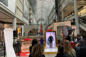
PORTL (by PORTL Inc.) is the first device that enables people to transport themselves visually to a remote location via a display. One of Canada’s biggest shopping malls used this product to do a virtualized fashion show! The models for the show appeared as projections through PORTL, while a live host described the outfits and directed the models. Naturally, this feature primarily focused on visual appeal and eye candy. Of course, a fashion show is easily one of the best examples of digital signage aiming to deliver a visual impact!
Another instance where this technology was used is in an Ontario-run wine and spirits store which displayed a bartender mixing up drinks.
Dining in outer space
If you ever wanted to have dinner in outer space, you’ll find this next one to be quite the treat. Space 220 is part of the Mission: SPACE pavilion at Epcot in Orlando. The video below showcases an immersive firsthand view of the project!
It relies on a multitude of displays to create an illusion of dining aboard a space station. The elevator with two main displays above and below simulates the experience of traveling ground up and reaching the space station. Its name is Space 220 because the space station is at “an elevation” 220 miles above Earth. Upon reaching the main area, visitors will dine with a splendid view of the Earth, alongside an astronaut or two flying by.
3D pandas on a street corner
We covered 3D examples of digital signage in a separate article. Since then, there’s been another fun installment over this busy Chengdu corner in China. To an unaware observer, it may appear as weak marketing because it’s unclear what this ad is for. With most anamorphic illusions of this sort, the goal may simply be to catch attention.
In fact, the goal of this visual presentation was to celebrate Golden Week. It’s a national holiday in China and likewise the best week for Chinese tourism. As you can see in the video, the pandas stretch out, eat and observe the world around them on a 888 square meter 8k resolution display.
The “top secret” video wall
We’re used to seeing massive video walls in places with high traffic. Indeed, their main purpose is always to impress the viewer and attract more attention. Functionality is important, but for the most part, it’s usually in balance with aesthetic appeal when it comes to relevance.
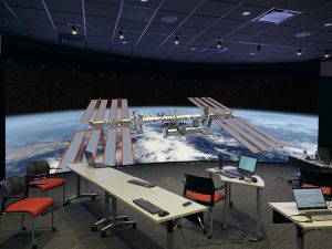
Meanwhile, this curved Sony Crystal LED wall is used purely for functionality! Its main purpose is to deploy drawings and 3D visualizations under review by an aerospace contractor. The drive for it came from the engineers’ need for detailed and immersive images for design reviews. This display system is 32 feet (9.75 meters) wide and 9 feet (2.74 meters) tall, in 8K resolution.
While the client may not be named, Sony was allowed to publicly go into some detail on this project: “The project team and stakeholders needed an impressive environment for internal and external design briefings. That required more than a mere video wall. It demanded cutting-edge 3D display technology from Sony, combined with unsurpassed design, integration, and virtual reality expertise—provided by Mechdyne—to enable all of the varied use cases and multiple image sources.
Making art with interactive displays
Up next is an interactive 20-foot wide interactive display at the University Campus of the Center of Creative Arts in St. Louis, Missouri. This is a 20 foot long video wall which reacts to the movement of visitors. It was put together by SOSO, a Boston-based creative tech firm. It is a vehicle to explore and create art through movement. The system works through infrared cameras which track physical movement and transform it into colorful waves of particles. Check it out in action:
Restroom sensors combined with digital signage
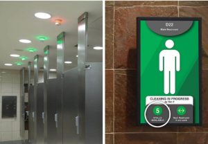
Our last example is a trivial solution at first glance, but at a second look it appears quite handy, no pun intended. Tooshlights is a company which produces sensors, indicator lights, and software for managing restroom status in busy establishments.
Green and red lights over toilet stalls highlight which stalls are available. The light turns red when the stall occupant locks it from the inside. This eliminates the need for touching, leaning on, or looking for feet under the door to check if someone is already inside. The addition to these sensors is a central display showcasing live occupancy of toilet stalls. It is perfect for busy places like airports and sports arenas, even when observed in a non-COVID context.
Take a look at more examples of jaw-dropping outdoor ads!


