With exhibits changing, digital signage in art galleries and art shows needs to adapt accurately and consistently to match them. Digital signage can enhance the exhibit experience significantly by providing information about each art piece and the artist. Promotions about upcoming shows and unique pieces are an added plus. Digital signage software comes in as a key component to ensure everything is updated precisely when it needs to be and delivered with a visual layout that blends in smoothly with the artistic environment.
The role of digital signage
Digital signage can achieve many goals in this environment, all of them elevating the customer experience as a whole. For a start, interactive digital signage in art galleries can provide information about current art pieces present at the gallery. This can be more in-depth and on demand. Perhaps the viewer wishes to learn more about techniques used, the style itself, history of the art form, the artist, their background and inspiration, or even compare it with other pieces. This offers a great opportunity to promote artists, their portfolios, other work available for purchase, etc.
Digital signage can also provide information about the art gallery itself, its plans for future art shows, and its own history, goals, and any other unique sides there are to share. Of course, this information is secondary to information related to the art itself. This is why it’s best to have separate displays for these uses.
Content management
Digital signage software is a must-have component for this environment. As art galleries rotate the art that’s on display, the content on digital signage must rotate with it to ensure the best and most accurate experience for visitors. Simply schedule content as you determine when an art show is taking place, which is an effortless exercise once you set up your templates.
Another great use of digital signage software is the ability to design your own interactive layouts. For interactive tablets, for example, you can create layouts with buttons users can press to scroll through the content. Using QR-codes as buttons is another option. These trigger as the user scans them with their phone. However, these might be best used for simpler layouts where there is one or two pages to show. For instances where many button presses will happen, it’s better to go for the touchscreen.
Easy content updates
If you have a steady rotation of art on display, each time you create a banner or a layout for them, you can simply re-use it for upcoming exhibits. This can also work as the art travels across multiple locations. For exhibits that are more temporary and limited, it’s very easy to project the information on existing templates.
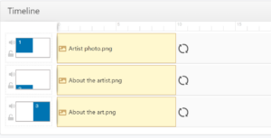
You can create content templates with the dynamic composition or a campaign, allowing you to section up your display and easily update the content for each individual artist or art show taking place. For example, designate half of the display for the image of the artist with a small banner that talks about them, and the other half on the description of the art.
Feedback and data collection
Collecting feedback is the quickest route to improvement. As visitors reach the exit, use digital signage to ask them about their experience. Whether it’s a simple rating, or a more in-depth questionnaire, lock in on what feels best given the complexity of the exhibit at the gallery.
Think about what incentives you can provide to convince visitors to engage. With the experience completed, at this point visitors are most interested in art! Inform them about artists that are soon coming to the gallery, and offer a 10% ticket discount for those who provide feedback. Even without the feedback, providing a discount for pre-purchasing tickets is another great idea as the interest is at its peak!
Improve the digital signage layout constantly!
Based on the feedback, adapt your digital signage content. Ask about the visitors’ preference and interests and adjust to it. Perhaps most visitors don’t need a floor plan, or most of them find a specific art style less or more interesting. Perhaps some data is excessive, or some content never gets brought up. Ask about it and adjust your layout.
Also don’t forget to ask about information that’s missing, or that’s not detailed enough. As you go through the list of all the questions you wish to ask, don’t overwhelm the visitor and instead spread them out to ensure you get a gradual dose of data collection without impacting the experience. After all, you don’t want the visitor to have a lovely experience brought down by a lengthy questionnaire.
Explore the layouts, content scheduling, and begin designing your next exhibit campaign with OnSign TV!
Cover image by adrianna geo.


