Spectacular uses of digital signage are always fun to see. On top of that, they provide a good learning opportunity! Of course, most small businesses don’t have the budget to invest in 20m tall digital billboards or overhaul their complete indoors with digital displays. But taking note of some of the most stunning visuals in the digital signage world can poke at the imagination. It might bring about new ideas, even if on a smaller scale. With that said, here are some of the most intriguing digital signage visuals that caught our eye in the recent months.
A zombie tiger stalks Piccadilly Circus
In May, the new Netflix film Army of the Dead had a stunning visual promotion at London’s Piccadilly Circus. It featured a wraparound LED board that brought a 3D zombie tiger to life. As you can see in the video below, the tiger appeared to be truly taken out of the movie and brought into the physical world, making for one of the more stunning visuals you’ll find!
The director of the film, Zack Snyder, said that the inspiration for the tiger came from animals at Big Cat Rescue. The tiger was entirely made through visual effects. Snyder pointed out that they purposefully opted not to use an actual tiger as they wanted to make a stand against the inhumane treatment animals have gone through for the purposes of filmmaking.
The historical Turf Moor football stadium gets an upgrade
In continuous use since 1883, Turf Moor in Burnley (Lancashire) is planning to get a massive visual overhaul. While not unusual to see a visual upgrade rolled out into massive heavily-funded projects for stadiums, the difference with this historic landmark is what they plan to create out of actually limited funding.
A lot of thought had to go into it and budget spending carefully planned. Above is a visualization featuring more than 1,100 square meters of LEDs across dozens of different screens, including curved LED billboards.
Coca-Cola’s LED ribbons
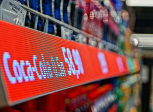
When it comes to finding stunning visuals or clever ideas, you won’t get far without mentioning Coca-Cola somewhere along the way. In one of their more recent endeavors, Coca-Cola has used LED ribbon strips in a supermarket chain in Russia.
While a somewhat understated move, Coca-Cola placed the spotlight on an already available but underutilized feature. A challenging tool to work with, LED ribbons can look bad due to low pixel density. This is one example that proves they can look really good! Is it a wise investment? It’s safe to say that the options and context differ for each venture. Smaller brands, for instance, will unlikely receive guaranteed shelf space in a supermarket to justify the collaboration. Meanwhile, for products as big and prevalent as Coca-Cola, this seems like a casual move to further mark their territory.
A display (almost) as big as the store
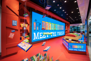
In the digital signage world, if size isn’t everything, it’s at the very least a lot! If you ever toyed with the idea of making a massive investment into digital displays and going all out on visuals, here’s some eye-candy for you! The new Tony’s Chocolonely store at Schiphol Airport in Amsterdam features a display so big it could pass as one of the store’s actual walls. This massive video wall does a splendid job at pulling people in. Take a look at some more photos!
The display’s appeal is further boosted by the fact that the Tony’s Chocolonely is a vividly colorful brand. It offers chocolate bars of many sizes and flavors, alongside a plethora of other colorful items. This makes for some great eye-candy. Literally! It just goes to show that bigger is always better in digital signage, as long as you have the right content strategy.
Step into a real jungle on the Las Vegas Strip
Margaritaville on the Las Vegas Strip offers a jaw-dropping show, quite fitting to its location. Named The Volcano Show, this is a regularly scheduled multi-sensory bar event. The combination of projection mapping, LED/LCD displays and surround sound results in a truly immersive experience.
This virtual environment can transport you into the heart of a jungle. It features waterfalls, margarita glass trees, volcanoes, and—rumor has it—a bear. This is certainly one of the more splendorous and rich examples of digital display technology use. But even here there is something a digital signage user can learn. It just goes to show how much life digital signage can breathe into a room when combined with other elements and factors.


