Layouts come in many forms and sizes. While rectangular in nature, digital signage layouts can take many possible variations. In this post, we’ll explore a few layout versions to spark your imagination for your next campaign. Before we begin, keep in mind these are mere suggestions. Feel free to tweak them depending on the content you have available and what looks best in your specific context.
1. Featured product or service layout
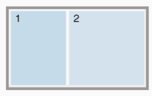
This simple two-part layout promotes a specific product. Perhaps it’s a new version of an existing product, or simply to test the appeal for a specific product or service.
With a 40-60 division, one section features a nice visual impression of the product you want to highlight, while the other section contains supplementary information about the product. For clothing this can include available sizes and colors. If it’s electronics, make a list of available memory, power, or any other spec which matters. Experiment by flipping the sizes of the sections, depending on which part is more appealing, the visual or the informational.
2. Featured products with testimonials
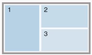
This layout is similar to the one above, but here we can split the screen in a 40-30-30 division.
The biggest section showcases the product or service image. The second part can cover the product information, and the third can include a rotation of brief testimonials, including star ratings or comments.
3. Slideshow of new arrivals
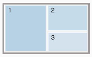
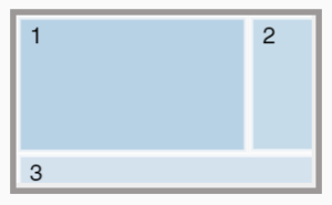
To truly show off each of your new arrivals, build a slideshow which features products in a 50-30-20 layout.
On half of the display, show the image of the product. The upper 30% section can contain a brief flash of most important information such as the price, product availability, or a catchy sales promotion. Finally, use the lower 20% section to display a QR code that’s big enough and easy for anyone to scan. This can take them online to obtain more information, check availability, or even purchase the product from your store right away.
4. On-demand content layout
A really lovely way to make content available on demand is to dedicate a portion of the display to interactive commands. You can achieve this with touchscreen displays, by assigning a portion of the screen to respond on contact. For displays which don’t have touch capability, use QR-codes which act as buttons users can “press” when they scan them.
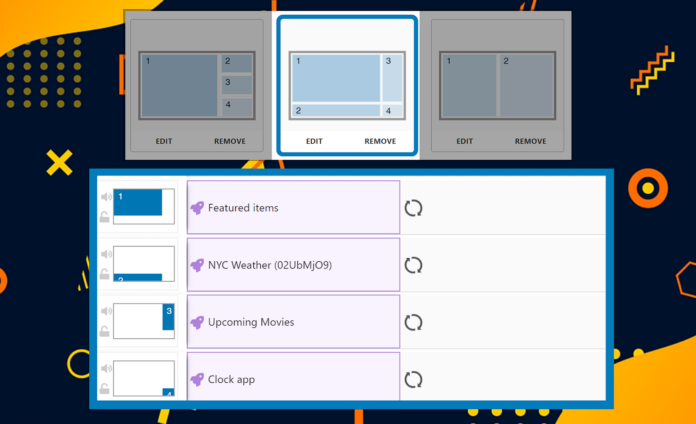
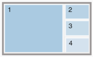
A neat layout for this can be a 70:10:10:10 variation, where the biggest part contains your main content (narration, videos, promotions, demos, etc.), and each of the smaller ones contains your button of choice, be it an actual touch button or a QR-code.
5. Company story and branding
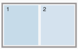
If you’re looking to share the story of your company, you may want to create content aimed towards your employees or your customers. A great vessel for this sort of content is the 50:50 layout, where one of the halves is further split into smaller sections if needed.
For instance, one half of the display can feature company images, videos, or any ads/campaigns you created for this purpose, ideally with subtitles! The other half can contain information such as fields of activity, about us, newsletter signups, surveys, feedback, or even more in-depth text which shares the story of your brand.
5. Entertainment layout
Fun digital signage layouts are a great way to kill boredom and lower perceived waiting times. Your layout will change depending on the content you have, so it really depends on puzzling it nicely together. OnSign TV apps are very flexible and can stretch to fit all kinds of layouts.
For example, you can section the display into three parts, in a 60:20:20 layout, where an engaging video can take up the largest portion, and the other two parts show an inspiring picture and a fun fact on a particular topic.
6. Use apps with existing divisions
Keep in mind that some apps already offer screen divisions which work really well together. For example, the Casual Menu Board app shows off menu items, but also dedicates a portion of the display to highlight a particular item in more detail. You can mark the menu items you want to bring into focus, i.e. mark a few or all of them. For bigger displays, feel free to include an additional section alongside this app.
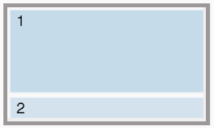
So the screen layout can be 80:20, where the upper part of the display contains the Casual Menu Board app, while the bottom contains a social media banner or a similar bit of content.
7. Social media layouts
Social media information is easy to include within your digital signage layouts without interfering with main content. It can be squeezed into corners to fill in awkward spaces created by other divisions, as banners on the bottom, or on the side of the display. Social media is pretty self-explanatory. You just need the icon and your user handle.
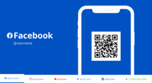
For a more prominent highlight, consider using the Follow Us app available with OnSign TV. This app will scroll through each of your available social media accounts. You can customize the app to change the background colors, include an image, and even choose between Android and iPhone illustrations.
Explore this app with OnSign TV! You’ll also find plenty of others which section up the screen in a more exciting way where divisions interact with each other.


