A study conducted by restaurant industry consultants showed that drive-thru and menu boards are strong selling tools. Sadly, the study also found that many, close to 70%, of quick-service restaurants fail to use their menu boards appropriately! Furthermore, while drive-thru menus do experience high traffic, indoor menu boards proved to be more powerful at encouraging bigger orders.
Perhaps the most important piece of information collected though, is that both evidently are difficult to read for many consumers. Research showed that 55% found drive-thru menus easy to read; 60% thought the syme for interior menu boards. This data is quite concerning as it clearly demonstrates the unspent potential of menus in quick-service restaurants. We are only able to scratch the surface of that asset and see how your menu boards, traditional or digital, could be made clearer and more legible.
Indoor digital menu boards
This must-have menu type for quick-service restaurants is the key selling element, thus it needs to be designed with care. Your digital menu boards, or even traditional ones, should be inviting and easy to read. Here are some notes to keep in mind when designing them:
Don’t list too much. It is ideal to rotate your offers throughout the day, enabling you to show and sell all items on your menu without overwhelming the consumer at any point in the day. Breakfast, lunch, and dinner menus are a great start. For multiple-display menu boards, which are in any case recommended, dedicating two displays to time-of-day offer listings is a good rule of thumb. Others could be used for special offer highlights with mouth-watering images that require more space and designing.
Keep formatting simple. If your breakfast menu consists of a handful of items, there is no need for dashes, dots, or lines connecting the food with the price. They’ll serve no purpose but clutter.
Use large fonts as this ensures the text is visible and nobody has to squint or struggle to read everything. Consider that the person reading the menu board is usually the one waiting in line at a slight distance from the counter, not the one standing right at the register. A variation of sizes can also be good, showing the most important information, such as pricing for the full meal package. Meanwhile, somewhat smaller fonts could indicate less important information: nutritional value, pricing with just the main item from the offered meal and so on.
Avoid fancy fonts. They may be beautiful, but reserve them for content with few words, such as logos or, for instance, the word “menu”. They’re not ideal when trying to gather and digest a large amount of information.
Drive-thru menus
As an entirely different source of traffic, drive-thru requires unique menus. Just like indoors, menu boards can be digital or traditional in writing. Oftentimes people are overwhelmed with the multitude of choices shown to them here. Because of that, the same tips for indoor digital menu boards can be applied. But keep in mind that in a drive-thru, people want to absorb information, order, and get their food as quickly as possible. They are not in the market for unique experiences and tastes, rather convenience and pace.
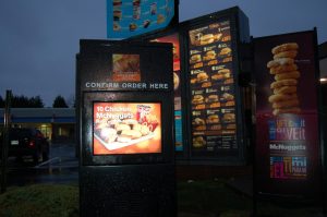
Though most come to drive-thrus with an order in mind, menus can still influence. Customers are unlikely to study the entire menu, however. Time is of essence, if only for the person in the car behind pushing you to move. In a restaurant you could defer your spot to the next person while you continue to reflect on your order. At a drive-thru the line is fixed. This is why, drive-thru menu boards should be shorter and simpler than their indoor siblings. While on the subject of simplicity and accessibility, take a look at one bad example of drive-thru menu positioning. The author of this picture wrote: “How am I supposed to see the dinner menu again?“
A great option for drive-thrus is interactivity. But if you do choose to set up interactive menus for ordering, ensure they’re simple to get a handle on, are not at an uncomfortable height for either very high or low cars and don’t fail with gloves, and always offer order by speaker as an optional choice.
Images and color combinations
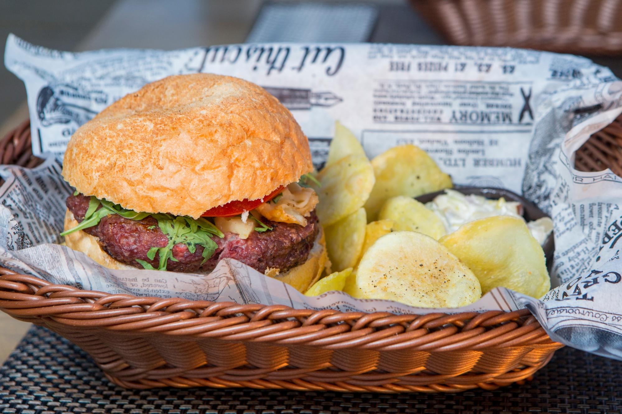
Images can be a tricky component to include in your menus. They can be a powerful tool to encourage specific orders, but too many can overload the entire thing. Fortunately, digital signage can compensate for this. While traditional menu boards struggle, even the ones with the capability of rotating content, digital ones do it so much easier. Setting rotations that highlight 4-5 meals can be done with or without images.
As for the topic of colors for text and menu background, there is much debate on which colors influence people the most, particularly to whet their appetite. But you may find that suggested colors clash with your unique brand style. Keeping matters simple, whatever your color identity is, ensure the contrast is there so the words on the menu can be easily read.
Black on white is a good start, but keep the words of Howland Blackiston who led the visual assessment in the above-mentioned study in mind: “All menu boards are starting to look the same—70% have white backgrounds. Typically brands want to differentiate themselves and menu boards can play a part in this without sacrificing legibility and ease of use.”
With these guidelines in mind, you can polish your digital signage menus further. Likely, as you should, you use digital signage software to make this task easier. Additionally, look into other ways of diversifying your content, including the content on your menus. As demonstrated, your unique style can and should be present in everything you display on your screens. Take a look at another unspent potential lying ahead!


