Digital signage has multiple applications for every environment. It can bring you closer to reaching your communicational goals, if utilized properly. With that said, it’s important to know how much of an impact digital signage can make if not utilized properly.
Typically, a digital signage network is an investment not taken lightly. The last thing you would want is for that investment to turn against you and prove to be a drain on resources. Here are five main ways in which you may inadvertently achieve just that!
1. Over-utilizing features
Just because your software grants you the ability to display a data chart, split the screen and display the current state of the weather, doesn’t mean you should actually do all of it at once. There is such a setting where all of these may be used at the same time, perhaps in a massive video wall where you want to display as much as possible.
Even if you explicitly want to use multiple features at once, you need to be sure they don’t cancel each other out by making the presentation look like a mess. One great example of this can be seen in an article from Sixteen:Nine which can truly be described as “everything not to do in digital signage, in one gloriously bad pic.”
2. Not doing the necessary adjustments
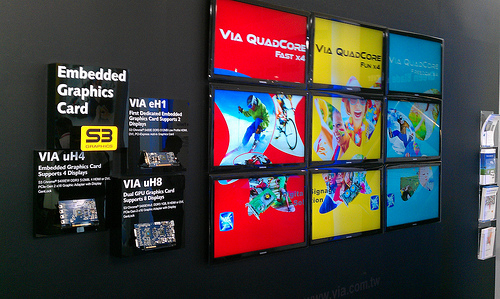
Bezel width and compensation is critical when using multiple displays to form a video wall. Bezel is the area which surrounds the display, and if it is not adjusted, it can make the large picture look like a puzzle with uneven pieces. Furthermore, color adjustments for each display are important, as some displays tend to generate a different tone than others. This is particularly evident when it comes to skin tone and similar image schemes which rely on color consistency.
The alignment of video-wall displays is equally important and usually requires additional equipment to ensure the displays are perfectly linked together. Note that certain content types will not have a problem with minor alignment issues, but such glitches can become easily evident upon closer inspection.
3. Ignoring the testing phase
Explore the features of your software and hardware before releasing the displayed content into the world. It is guaranteed you will not get the perfect digital signage setup on your first try. Adjustments are critical, and putting yourself in the shoes of your audience is the best way to do them. Font size, content clarity, color schemes and content type are all easy to fix, which further strengthens the reasoning that the testing phase shouldn’t be ignored.
The testing phase doesn’t rely solely on the software, though. Drilling holes in a wall is not as easy as simply altering the font of the text, which is why you should take all physical factors into consideration before setting up a display. Will the display be exposed to sunlight? Is the viewing angle adequate for your audience? If possible, make the necessary adjustments. If you find that your display will be rendered useless by sunlight in a given location, change it! Waiting rooms, lounges, elevators, or check out points are all great locations with a lot of wiggle room.
4. Using audio in loud places
This cannot be stressed enough: in digital signage, audio is an enhancing component, not a fundamental one. By no means should you ever create a digital signage presentation which relies fully on audio to be understood by your target audience.
There are many reasons audio can fail in a public area. For starters, the environment surrounding the display may be too loud, the display itself might not have sufficient volume capacity, or your audience members might not pay enough attention to the audio. The power of digital signage lies in its visual effect and its ability to transmit your message to a viewer at a single glance. Audio can be a complementary component, but if you rely on it entirely to transmit your message, you might as well shut down the display.
5. Minimal or no data automation
Automation is practical, saves time and transmits a greater deal of information in a given period of time, as opposed to data which is not automated. This the main reason why digital signage software plays such a critical role for your digital signage presentations. Among others, not using automation is one of the main mistakes digital signage users make. As for the others, you can read more in this article by Richard Fortin, ITES Media.
Most mistakes might typically go without saying. However, it is very often that people find themselves making them because they’ve neglected to think ahead or take the perspective of their audience into consideration. Most mistakes can be avoided by doing your best to put yourself in your audience’s shoes. Looking at some great examples of digital signage locally, or even online is a great starting point!
Image by viagallery.


