
For the savvy content creator, choosing the best fonts for a digital signage campaigns is an important task. Keeping in mind where the content will be used is fundamental. For example, the internal audience—your staff and employees—will be more forgiving than your external audience—your customers. To appeal to your customers, you have to draw their attention and hold it long enough to deliver a message. That message mostly comes in writing.
Know that particular rules apply for slogan text on an ad which aims to attract attention, and entirely different ones apply for paragraph text about your business on an interactive display. Thus, there is no one size fits all approach we could give you an absolute recommendation for: it’s the context that makes or breaks your message. Instead of absolutes, we’ll provide you with ways to make the right choice for each different occasion!
Choosing a font
Many content creators want their text to have a dose of personality and identity. It is indeed important to have that individuality in your message, you should however abandon that principle when it comes to using fonts for your digital signage. You may opt for a fancy font because it suits your brand visuals but you’ll find that it might make your text difficult to read.

For instant comprehension, use Sans-Serif fonts for your digital signage as they’re the fastest to analyze. Open Sans, Arial, and Helvetica are excellent starting points. You’ll find that a Serif font looks better for something as short as a single word, such as the word “SALE,” which everyone can comprehend at a glance so they won’t be thrown off by the additional decor on the letters. The same applies to terms that are instantly recognizable especially when in season, such as the words Black Friday, Christmas, Thanksgiving, New Year, Sale, 30%/50%/70%, etc.

With Serif fonts, the more words you add, the longer the delay in comprehension. Hence, stick to Sans-Serif for any message intended to draw attention and be understood near instantly. You can reserve Serif fonts for longer bodies of text a reader takes the time to attentively read.
If using custom fonts, be very careful! Even if they are Sans-Serif fonts, custom fonts typically have a unique style and curvature. And while they are visually appealing, the eye might be unable to recognize multiple words at a glance. Instead it analyzes one word at a time. Custom fonts can be a cool way to highlight one, maybe two words, but rarely a sentence. Test them out thoroughly before using. Additionally, avoid using more than two different fonts within one visual setup.
Finding custom fonts
Fonts are like candy to content creators: which one do you choose when the whole candy shop is in front of you? Digital signage software will typically offer you many choices of fonts best suited for outdoor advertising. This ranges from simple Sans-Serif fonts to highly-decorated and detailed scriptures ideal for very rare and special occasions. Check out the fonts OnSign TV offers, for free! Still, even with this vast selection, you may want to use custom fonts you’ve created or found. Your digital signage software provider should have you covered and enable you to upload them!
If you want to look around for custom fonts for your digital signage, there are plenty of websites that host fonts available for commercial uses. DaFont, FontSquirrel, and FontSpace are great places to start. Be sure to tweak the search settings to only display fonts available for commercial use. You’d be surprised how many good results come under that tag!
Contrast
I’m sure you’ve picked up on a pattern by now: the text has to be easy to read, yes? And contrast is the number one reason so many outdoor messages fall flat on their face on this task. That’s because contrast refers to so much more than just black text on a white background.
The color of your text should be as opposite and contrasting to its background as possible. Sure, black on white might be boring, but it’s the perfect contrast setup to start with. Use this as a guideline. If you insist on coloring your text, start with changing the hue of white. Fully colored text will require some testing before it looks good. You should also be very careful when using highly-saturated colors. When placed side-by-side, these colors appear to vibrate and move, causing a phenomena called color vibration.
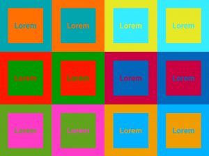
Ads have always used such over-saturated vibrating visuals to attract attention, which has created an additional aversion towards them. This is apart from their visual discomfort, which I’m sure you’ve noticed tugging at the corner of your eye by now. In order to soften this vibration, add an outline around the text to break it up. Although the best advice here would be to lower the saturation in at least one of the colors.
Contrast and daylight
Contrast also changes with daylight, and what works by day won’t work in the same way by night. At daytime, dark letters on white background work very well: the text background matches the surroundings, so the letters stand out more and are more comfortable to read. At nighttime, this won’t work. A bright glowing screen will draw attention to itself, momentarily blinding anyone who looks at it, and the dark text on it will be harder to read, not to mention disturbing. You need bright letters on a dark background.
Finishing touches!
To wrap things up, here we have a few additional guidelines to your text styling that don’t directly apply to fonts but will make your screens do their job better.
Trim the length of your message in any way you can. Aim to have a single line per message. Instead of saying “If you buy 2, you get 1 free” just write “2 for 1.” Your consumer has sufficient experience to grasp shorter messages, so rely on that inherent knowledge.
Create Feng Shui in your visuals, aligning them carefully. Make related lines parallel and space the separate messages and colors appropriately to avoid cramming everything together. Don’t let any of your text touch the edges of the screen, unless that has a specific design benefit. Play around a bit to see what looks best!
Test, test, test! Testing is crucial because the visuals you create look very different on an outdoor display than they do on your computer monitor. By testing this on your displays, you’ll likely find that certain misalignments become more apparent when viewed from a distance. Contrast will always change from display to display, the question is how much!
And finally, track the progress! Once you deploy your new design, pay close attention to how your audience responds to it through analytics. If you experience a noticeable change in traffic, interaction, feedback, or revenue—whether good or bad—you’ll know if you’re on the right track.


