A digital display is truly a magical tool just on its own. Sure, we’ve gotten used to seeing displays everywhere we go, but when you use them in creative ways, they still have the potential to bewilder and stun the viewer with its visuals. This is particularly effective when you crack the code on how to merge your digital signage with its surroundings. Doing this extends the content you create beyond the edges of the display and brings them deeper into reality.
We’ve seen some jaw-dropping examples in major advertising campaigns, as you’ll see below, but you don’t need to be a big spender or own a giant digital billboard to get fabulous results. Apart from a display, all you need is dedication and a little bit of imagination.
The simplest adaptation of all
Before we dive into the more complex adaptations you can only do if you have time and resources, let’s cover one which every digital signage content creator can do. The most primary way we merge digital signage to its surroundings is with brightness. We can anticipate the level of brightness outside pretty easily because it’s been on a fairly stable cycle since the beginning of time. For roughly one half of each day the brightness is high, and for the other half there is no brightness at all, right? So the display needs to become brighter in daytime, and dimmer at night.
You can do a lot more than just automatically tweak the brightness scale on your displays.
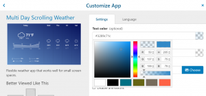
Design the content specifically for nighttime versus daytime. Not only does this ensure your content looks better (and not just dimmer) as each part of it is carefully thought about, it becomes easier and more comfortable to process for the viewer. Above is an example of the OnSign TV weather app which you can color customize for this purpose.
Create a 3D view
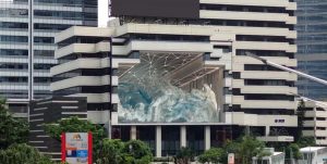
If the physical surroundings of your display have a pattern, a theme, or something noticeable to the eye, use it to add another dimension. Of course, it doesn’t need to be as complex or stunning as the example below, but it can provide that extra spark to your visuals.
This process will require a bit of creativity and a lot of precision. Then it can bring stunning results. For this reason it’s recommendable to have a theme with your content, content frames, and a color theme in your business in general! Incorporate them into the physical surroundings of your displays, as well as the content. Your display could become a magic mirror, a temporary window into the outdoors, or extend the color pattern in the background. These minor tricks of the eye are bound to catch attention and they’re a great visual kick if you have the time and patience to create them!
Blend with the surroundings
3D illusions are a stunning sight, as you just saw. Even merely scratching this surface can bring plenty of benefits. You don’t need to create a complex window into an alternate reality to get a result. When you merge your digital signage with its background, even slightly, it becomes a more useful configuration. It can create the illusion of transparency by filling in the visuals that are obstructed by the display itself. Flowers, plants, or a color pattern cut off by the display can be recreated as a background within the display itself.
This can even make the display less noticeable which is beneficial in some contexts. For example, in fine dining or relaxing environments, a big bright rectangle breaks the tranquility of the space. Toning it down, providing visuals that allow it to blend in with the background pattern could allow the display to do its job without appearing tacky or drawing too much attention to itself. After all, people spend loads of time in such environments. They’re bound to notice the display sooner or later, so there’s no need to push it strongly.
Placement is key, but not just for the visual kick!
The adaptation of your displays to the surroundings should begin at the very placement of the display. The visual factor of a display merging perfectly with its surroundings yields exquisite results. But don’t forget the primary purpose of your displays. They’re aimed to provide information to your audience, so first and foremost ensure they’re at the best possible location within your unit for practical purposes. Only after that should you focus on the visual touches.
Firstly, aim at spots where people spend the most time within your location. This puts waiting areas on top of the list. Then ask yourself, where do people linger or stop? Which path do they take to their objective? Essentially, where will the display have the greatest potential to catch attention. Lastly, of course, consider the visual obstacles that might limit the view of the display in question. Consider the comfort of observing the screen from all angles. After all, what’s the point of having a stunning visual – 2D or 3D – if nobody can see it?
If you’re an OnSign TV user, take advantage of the transparency of all OnSign TV apps to overlay them onto the principal visual content you create. Furthermore, customize the fonts and color combinations to get the best results! And if you’re not an OnSign TV user, try it out with our free trial, no strings attached!


