
In an earlier post, we discussed a selection of solid guidelines for setting up the design of your Dynamic Compositions to ensure they are highly effective. The main aspects we pointed out were maintaining a visual hierarchy, limiting animation, and being consistent in the overall design. For more tips on designing the perfect digital signage layout, be sure to check out the full article. This time around, we’ll focus on tips that about what to avoid in your designs. We’ll particularly focus on things that tend to happen unintentionally.
Overcrowding
The most common issue that happens with any design is the placement of too many visual elements on a display. Digital signage is a great conduit for communicating with the audience, yes. Yet, oftentimes content creators try to cram too much in. This is probably the vaguest tip on the topic, but keep your eyes focused and establish a level at which your particular design becomes overcrowded.
Eliminate anything that is unnecessary for the viewer. Ensure the primary message is easy and quick to understand, without needless text and without overbearing visuals. Of course, it all depends on what you want the audience to perceive. If it’s an information terminal we’re talking about, include a range of text feeds, by all means! Then the rules change and you have more room for content. On the other hand, if you want to attract and excite the viewer in seconds, overcrowding happens all to quickly.
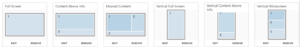
Random placement
Following a visual hierarchy is key. Never scatter elements randomly on the display without a purpose. If you can’t justify a purpose, remove the element entirely! Anticipate where the viewer’s eyes will flow on the screen. If you notice that the elements are scattered and the viewer is lost where to look, readjust your arrangement of screen elements.
If you’re interested in visual hierarchy, we discussed it in greater detail before.
Forgetting about whitespace
You may feel the need to make use of every single piece of space on each of your displays. However, empty space is quite important to maintain a neat division of elements. It is particularly important when there are more than two separate messages present on the display. Creating a clear divide around and between visual elements will guide the user better. They will study each element separately, knowing which pieces of the display are interconnected.
Inconsistent alignment
Closely related to whitespace, it’s important to be consistent in how your content elements are divided. If one division is more important than the others, it should stick out more. Similarly, aligning content elements in parallel positions will create a cleaner sense of order. We previously discussed the Golden Ratio, which demonstrates what a sense of visual hierarchy looks like.

Furthermore, if you consistently use the same alignment for the same number of elements on the display, the viewer’s eye will get accustomed to it. They will process other content of the same layout faster.
Overly complicated layouts
There are only certain instances where three, four, or more sections are needed on a digital display. In most cases, this is only applicable when your audience is willingly spending a greater time in front of the display. Such occasions are for instance info boards, terminals for answering questions, and any type of content triggered on demand.
Meanwhile, when you’re looking to engage new viewers, you have only a few seconds to do so. With an overly complex digital signage layout, only the part of the display that sticks out the most will be noticed. Instead, try to keep it simple when you’re on limited time.
Don’t be afraid to design several simpler layouts instead of one complicated one. Then simply set them to rotate or be triggered on-demand.
Neglecting the focal point
The focal point represents the center of interest for the viewer. You should never leave the focal point up to chance and instead determine it beforehand. The viewer’s eyes will always go to the biggest chunk of the display. Knowing that, place the most important element in that location.
Overusing contrast
If every single piece of content on the display is special, then none of them are. The point of contrast is to allow certain pieces to stick out over others, as was the case with the aforementioned section sizes. In that sense, always make the most important part the biggest.
Meanwhile, overusing contrast also happens with color choices, text fonts, and sizes. It may result in a loss of focus, making it challenging for viewers to identify the important points of the display. It may reduce visibility, impact the overall appearance of visual elements, and result in ineffective communication. That last bit is most certainly the worst consequence.
Ignoring feedback
Easily the biggest mistake you can do when building a digital signage layout is not considering feedback, both from staff and consumers. If you’re just starting out with designing digital signage content, there is always room for improvement. Test the visuals out yourself on the displays and ask for feedback.
It’s important to do these tests on actual digital signage rather than on the platform where you’re designing it, because it looks different on a larger screen from a distance. Brightness levels change throughout the day, and viewing angles may impact legibility, for example.
Get to testing and experimenting with Dynamic Compositions right away, for free!
Cover image by stevenlondon.


