
Using the Dynamic Composition, you can quickly stack visual elements of different types together to create a unique digital signage layout every time. The quality of the design elements themselves is very important, and we’ll briefly talk about it in this article. But we’ll focus more on screen division and key principles to stick to so that the content you worked hard on will be presented in the best possible way.
Polish your content designs
Read up on primary design guidelines for your content when building it for digital signage displays. Establish order within your visual elements and be mindful of the complexity. Adjust the complexity based on whether the content you design will be full-screen or alongside other elements. Other important topics to mention when talking about a digital signage layout are color schemes, the environment of the display, call-to-action, as well as some common design mistakes which are frequently made on digital signage!
With that in mind, let’s talk about screen division!
Maintain visual hierarchy
The elements on your display need to be organized in such a way that the path of the observer is predictable. Most important elements must draw attention to themselves first. The less important elements should then naturally be explored by viewers who are interested in more information. The issue which arises when there is no visual hierarchy is that the observer doesn’t know where to look. If the elements are codependent on delivering a message, the viewer will absorb it in fragments, sort of like reading a sentence that’s all jumbled up.
Take a look at the example below and you quickly get a sense of what a solid visual hierarchy looks like, both for a digital display as well as for content in general.
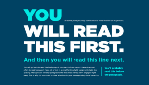
As you immediately see, the positioning, size, and color contrast of the content all play a role in making certain elements draw attention to themselves over others. As you observe the image above, you can surely already imagine how you’d draw dividers across it if you were to publish it on a digital display.
Divide display layouts carefully
Maintaining visual hierarchy is important in any delivery of visual content. It’s a huge part of designing your next digital signage layout. With digital signage in general, the biggest challenge is to divide the display properly in order to maintain it. We can find a great example of visual hierarchy in news on television. News broadcasts typically have a tiny text ribbon at the bottom displaying news alongside the main content but will not disrupt it. A viewer will only shift their attention to this ribbon if their interest in other content has weakened.
With that in mind, when your screen is divided into multiple sections, consider which one among them is most important for the viewer. Use your own judgment on this and keep other factors in mind, such as the fact that in some cases all elements have equal value. This could be the case in entertainment displays which aim to provide something for everyone. On the other hand, if you run a carefully constructed ad which demands undivided attention, it’s best to give it the biggest chunk of the spotlight.
Create balance and symmetry
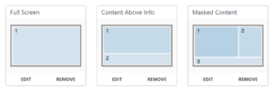
When dividing elements across your display, it can be tricky to balance out more than two elements, especially if they’re different resolutions. Try to stack and achieve some semblance of symmetry. OnSign TV’s Campaigns offer some predetermined layouts that are great examples. Right away you can see which piece of the display would be best suited for the main content and which for secondary elements.
Balanced division will lead most viewers’ eyes to the focal point of your content which is most important. To streamline the design, put a relative amount of space between content elements to separate them from their surroundings.
Limit animation
Visual elements in motion draw attention to themselves. Of course, the effect is entirely negated when every section of the display is animated. Keep this in mind as you test your layout designs. There are too many potential combinations making it difficult to give a clear example, but try to limit animation to one or two elements which are consistently in motion. Two videos, for example, might create confusion. Instead of playing them side-by-side, it would be better to rotate between them.
The beauty of digital signage apps is that they make use of animation to show the content or make it disappear seamlessly. Be sure to use them whenever applicable to the content type you publish.
Location is everything
Context might be a better word, actually. It’s imperative that you know what audience type will observe the display you design content for. Storefront displays, for instance, can’t really afford to have multiple divisions. At the very least, there should always be one division of the display overpowering all other divisions. The job of the storefront display is to draw attention and engage passersby to step indoors.
Indoor displays, on the other hand, have more freedom. Quite the opposite from the storefront, indoor information terminals don’t need to seek too much attention. They can afford to have many sections and visual elements. However, if they are interactive, they should cater to the customer and be user-friendly, guiding the users’ eyes and interactions in a seamless fashion.
Be consistent!
Ensure the first dynamic composition is as consistent in its design principles as the last. Based on content types which repeat themselves across all displays, be consistent in their placement. Put them in the same corner or section of the display. Keep fonts, text alignment, font sizes, and image placements consistent so viewers get accustomed to them. Consistent color combinations are useful for both the designer and the viewer. It makes establishing contrast easier during the design process, and it also makes it more memorable for the viewer.
Screen division, too, should ideally be consistent. By using the same layout repeatedly, viewers will get used to it and will learn to absorb information more comfortably. Something to keep in mind, consistency is most appreciated, and inconsistency is most noticed, in waiting areas.
Test and experiment
When designing anything, be it a complex video ad or a simple two-part display layout, it’s difficult to be objective. Since you are the one deciding how content is placed, your entire attention is focused on this. Yo will notice things most people will not. This subjective perspective can easily cloud your judgment on what makes a good digital signage layout. Think of it as a painting. The artist knows all the intricate details, but the viewer has an entirely different perspective.
Ask for objective opinions from a viewer who hasn’t seen your campaign yet. Don’t explain anything, simply observe how they perceive the information, if it’s comfortable to the eyes, what drew their attention first, what confused them, etc. Testing is key! As you collect second opinions, you’ll quickly build a list of bullet points to go through for your next campaign or layout. There is always room for improvement!
Also don’t forget to explore all the possibilities that come within our Dynamic Composition. Plenty of shapes, fonts, styles, templates, data feed integration, and more! Lastly, if you’re not an OnSign TV user yet, what are you waiting for? Try it out right away!
Cover image by Hal Gatewood.


