
Digital signage is a platform with massive potential for any brand. It can be used in a variety of ways to spread your message to any pedestrian walking next to your displays. However, with so many great ways to use digital signage, there is an equal number of poor ones.
Mistakes are very easy to make, especially when it comes to design. We’ll highlight 5 common mistakes in digital signage, some of which you have surely made!
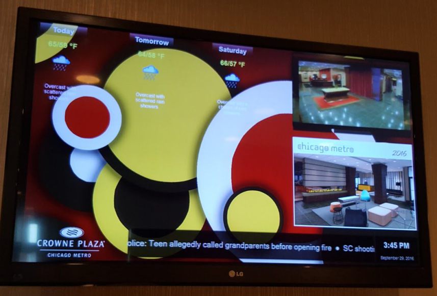
- Neglecting the visuals
90% of the information that reaches the human brain is visual. Just consider how easily you absorb information if it’s represented in the form of an image or graph. Dry text doesn’t hold its power on its own, yet so many marketers expect for it to carry their message to success. Whilst text alone can carry meaning, it will not attract attention. Be sure to include visuals in your digital signage if you want it to be remembered.

Images and graphics can create a richer and more complex message for the viewer just by being present. This isn’t achieved only because of the meaning your image has, but simply because of the contrast it creates. Contrast makes your content richer, and the beauty of it is that it can be very easily created.
There are many studies about different aspects of colors and which colors go well together, but you don’t have to be an expert to utilize this advantage. Any presence of contrast can be powerful, you just need to keep it in mind as you experiment and you’ll obtain its benefits. The aforementioned combination of visuals and text promises to provide you with at least some form of contrast in your digital signage. Still, learning more in-depth about great contrast combos is something you’ll be able to use for a long time to come!
- Weak font coordination
Fonts in digital signage can go wrong on so many levels!
First, many businesses make the mistake of assuming their text is going to be equally easy to read on a massive digital sign just because it’s visible on a small computer screen. Every additional inch between the viewer and the display demands a larger font, thus experimentation is required if you don’t know the distance beforehand.
Second, using multiple fonts is a crime to the eye committed far too often, especially in the same sentence. Some do this because they believe enhancing certain words can be helpful, but this never works. If you believe you need an additional font to highlight certain parts of your text, you have too much text present. This also applies to capitalized text.
Third, color can be complementary to your text. Yet, your message can very easily turn from a fun eye-catcher to a clown text nobody wants to look at. If you insist on using colored text, be careful not to go overboard. You’ll probably do better if you just stay away from it, otherwise your audience will do the same.
- Too many words, too little meaning
It takes a true gift to say much in a few words. Any marketer will tell you that an advertisement must make use of each glance it is observed. Unfortunately, many who use platforms like digital signage believe it will be observed for a longer moment, regardless of its appearance. This is one of the most common mistakes in digital signage.
It can be a challenge to find the right balance between clarity and words. Firstly, you want your message to be clear as day to the viewer, but you don’t want to go into too much detail on it either. Some business owners think it’s wise to display their entire company story on a digital sign, expecting people to relate to it.
- Too simple!/Too busy!
Design-wise, simplicity is much better than having a busy digital signage campaign. However, simplicity doesn’t draw in attention and a simple digital sign is less engaging. One of the many misused features of digital signage is automation, as well as the idea that automation equals circling the same content on a loop indefinitely.
On the other hand, a digital display that’s too busy can annoy the viewer and confuse them so much, they won’t understand your message. The balance between simplicity and complexity is critical, and swaying to a too simple or too busy digital signage campaign can ruin its potential.
- A weak call-to-action
Sadly, it is not rare to see a brand using digital signage for advertising and entirely focusing on describing its brand, products, offers or achievements. All of this is meaningless if there isn’t a clear Call-To-Action present. Some digital signage campaigns will include it, but it will be so poorly displayed that the viewer won’t even notice. For instance, a small-font link or phone number that’s difficult to see will do you no favours. What’s worse, some digital signage users forget to include a Call-To-Action of any kind.

These 5 categories of design mistakes are only one type under the vast umbrella of errors that can push your audience away from your digital signs. Perhaps you don’t understand your audience as clearly as you think. Or maybe there is a type of content that will work perfectly on your target audience, you just haven’t found it yet. Whatever the case may be, remember that digital signage is fluid.
Although mistakes are easy to make they are also just as easy to fix with the right knowledge. That’s exactly why you went digital instead of printing out your boards.
Images by Sixteen:Nine and Till Carlos for OnSign TV.


