Digital signage is a great tool when it comes to providing information in an exciting and modern fashion. It’s that darn engagement and getting viewers to take action that’s the real challenge. Building strong campaigns that inform and captivate the viewer can bring a lot of success to your business. There is an even greater potential for success if you can build content that does this at a single glance and helps you engage consumers in seconds!
It’s easy to inform at a glance, but it can be tricky to concoct the right mix of visuals and text to awaken the desire to take action immediately. Here are a few tips on achieving just that!
Build signage which is quickly understood
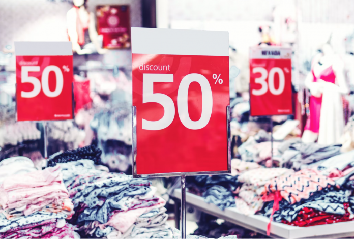
All of your signage should be self-explanatory within seconds. In areas with high foot traffic, you literally get a few seconds, if even that, to make an impression. If you can’t get it right, you’re missing out on a huge opportunity. In instances like these, it’s critical to trim down your message to its core. Eliminate as many words as possible, highlight the key words in the message, point out the discount percentage with highlights, etc.
Understand the way your audience perceives the message. Most people easily understand the meaning of “10% OFF!” Past understanding, your signage should invite the viewer to physically do something. Try to do it with simple language and without over-explaining what you’re selling. “2 for 1” says it all and better than “Buy one product and get another product for free!” Complete sentences are great for people who are already interested, but it’s those quick one liners that catch the most attention and truly engage consumers in seconds.
Intrigue the customer
It can be really tricky to explain long-term benefits in two or three words. Indeed, most content creators just give up on trying and use as many sentences as needed. “By signing up to our loyalty card, you get the following benefits…” It’s too much for a regular pedestrian to take in on the passing. Only a few will stop and give you their time of day. It’s hard work, but you truly can say a lot in just a few words if you know which words to use.
Loyalty programs, for instance, are a common feature offered. Yet, how do you inform a prospect about all the benefits loyal customers get at a single glance? Well, you can’t. So stop trying. Change your goal! Instead, work on intriguing them enough so they seek out this information on their own. A message that says “15% off for members” right away makes the customer wonder “How do I become a member? How do I access these perks? What other perks do members get?” If there’s a button on the display that provides this information, they’ll click it for no other reason than their curiosity. That’s sure to engage certain consumers in seconds, but as you continuously highlight the perks for members, repeat customers will recall and consider paying more attention to it in the future.
If there’s a product which sells out quickly, maybe there’s an early access only for members. Find the juiciest perk and point it out. It will make people feel as if they’re missing out, and they’ll start investigating. Similarly, when you see a discount on “selected items”, you wonder what these items are. It’s that ounce of mystery that makes the messaging more interesting.
Provide immediate results
Your message will attract more attention if it enables the viewer to take action right away and achieve a result only seconds after seeing it. Loyalty programs are more long term, sales invite to step inside and spend some time in your store, but maybe they don’t have the time to do it right away. Look into messages which provide a benefit so fast, time isn’t even a factor. The check out register is the perfect opportunity for this sort of thing.
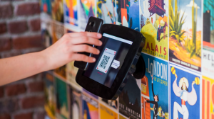
For example, set up a QR-code they can access. This code can send them to your website and provide them with a coupon code for a $5 discount on their final purchase. Even if the benefit is small, if the user can access it right away, they’re very likely to do it since it costs them no time. On top, it’s an exciting and engaging interaction. It feels like a treat at the end of the customer journey which they will surely remember.
Create content worth remembering
This line is not an inspirational quote. It’s meant to be taken quite literally! Apart from a sweet deal or a surprise award at checkout, you can create content which leaves a lasting impression. One example of this is the aforementioned message highlighting benefits for repeat customers. People will think about it later in the day. Limited offers are equally easy to remember as they provide a sense of urgency. If a sale is only available this week, or only for a certain number of shoppers, the viewer will be more driven to act.
Creating limited offers pushes the viewer to plan for the short term, making it more likely they’ll take advantage of the offer. The problem with this sort of messaging is when it happens too often. If there’s a similar offer every week, it doesn’t come across as limited. If there’s no sense of urgency or value, the viewer will not feel the pressure to take advantage of it.
Seek out a captive audience
Maybe it sounds a bit grim, but look for opportunities where the customer can’t run away from your message. This is the simplest way to engage consumers in seconds, after all. We talked about the checkout register already. The line at checkout is one place where people wait and their eyes begin to wander. Where in your business is the visitor spending time looking around?
There is an opportunity if your customer use displays to obtain the product or service. At gas stations which utilize displays, users need to select their fuel grade and fill up to their desired level. Their eyes are locked on the screen. That’s the perfect opportunity for an offer like a small discount through a code or QR scan. Self-checkout in general is the ideal place for messages which engage the customer right away. Don’t overdo it though. Remember, in our last month’s news set, we covered fridges which forcefully displayed ads on the fridge doors. This prevented some shoppers from seeing what’s inside, hindering their experience.
Rotate daily offers and highlight products
Don’t neglect the audience already inside your store. While it’s always good to quickly engage new visitors, your existing ones are even more valuable. Your approach here should be a bit different, as you want to nurture the connection you have to your regulars.
Use your digital signage to highlight certain products they value. Maybe the latest arrivals they might be interested in, or the daily discounts available.
This is where your digital signage software comes in to ensure quick and easy updating of your features. Above you can see the preview of the Menu Board App, which neatly lists your menu items, but the added benefit is the ability to highlight specific ones with a visual. Another app that can help highlight products and engage consumers in seconds is our Modern Sales App. Try out both of these, and many others for free!


