
While most platforms offer a great number of features to create your content – most of which you will definitely find useful – certain features will be more beneficial to you than others, depending on your business or industry. In case you suddenly realize you didn’t focus on this aspect before choosing your platform, keep calm. It will most likely not be a problem.

You’ve chosen the outer shell of your digital signage: the platform. Now let’s analyze the content creation aspect.
What to fill your screens with and how
Whether you set your own digital signage or provide it for a client, it’s safe to say there isn’t a template you can follow every time to achieve the perfect result. Neither would we want every screen to look the same everywhere. Depending on the targeted business, digital signage demands and encourages adaptation: this is its beauty and, at the same time, its challenge.
You should take all guidelines with a grain of salt and put in a drop of your own flavor and style.
The general rule of digital signage demands the average viewer be able to absorb and understand your content quickly. This is why, in general, it is advised to make content as simple as possible. Simplicity is one of the main features of good digital signage.
Layout
With this in mind, let’s start with a simple **layout**. Provided that the audience is exposed to your signage a sufficient amount of time, a basic layout delivering the most rudimentary information will do well. Simplicity is key and, in most cases, the structure requires as little text as possible to convey the message.
Short exposure
If the exposure is shorter – several seconds or even a single blink – your content should be concise and clear enough to be understood immediately. If it grabs the attention of the viewers, they will spend additional time analyzing the content. If your display is on a busy street and your target audience is not likely to stop to read your content, you should rely on simple messages without much else cluttering up the screen. Knowing your audience is one of the main tips for creating better digital signage content.
The distance from the content is a very important factor as well. Naturally, if your audience can’t see the content, the quality is of no importance. You can use ratio calculations to select the right screen size and match it to the amount of text required for perfect visibility.
Screen splitting
A basic feature most platforms are expected to offer is screen splitting. This means various content divisions for horizontal and vertical displays to truly utilize your hardware and content to the fullest. It’s also important to remind yourself that your template can be different depending on your choice between projection or flat panel digital signage.
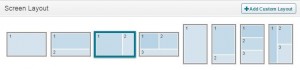
For horizontal screens, the most common (and most effective) layout would be a large area for the main content you want to display, whilst smaller divisions remain for additional content: weather, time or similar widgets which provide general information. For digital signage with high traffic and a short period of exposure, it’s typically best to stick to one general image and minimize complexity.
Vertical screen division can be done in a similar fashion. You can divide the content in equal fractions if you have various data to display. This is typically comfortable for tables, but the pattern with one division being the main one is also possible. This aspect of formatting greatly varies based on the amount of traffic and the content you want to share. Projection mapping can also be an interesting feature to use.
Include Features in Layout
Some features offered by decent digital signage are entirely stand-alone and provide general information any viewer could be interested in. These could be used alongside the content you wish to showcase, or simply on their own at a specific time of the day. Again, this depends on your surroundings. For example, if you’re set in a restaurant or a cafe, an occasional break from direct advertising may be welcome.
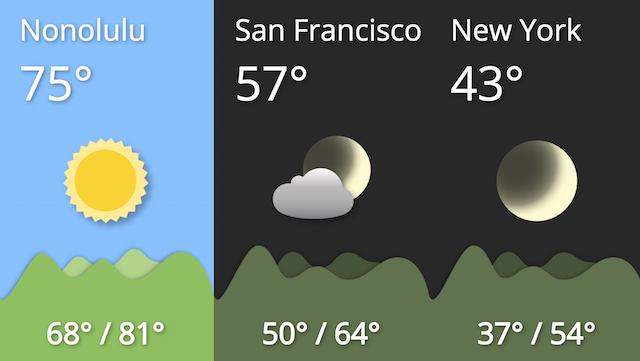
Time and weather remain the most basic, current and popular information. Clock widgets don’t take a lot of space, (unless you want them to, of course) and can be incorporated without much hassle. Weather apps may demand a bit more space, but not much is required to overlay the relevant data. Have these on your screens and you are guaranteed a couple of look ups.
OnSign Time and Weather
Cycling media is an option where you may select the content yourself, or choose an RSS feed for your displays. Daily news and news trackers have become a very common feature and are as easily set up as ever. You can stream financial data such as exchange rates, for single or multi-currency exchanges.
Social networks are commonly used to reach out to the target audience, and some locations even make use of it via digital signage. You can stream YouTube videos or content from Instagram and Facebook, for instance.
Specific text formatting in directory lists, charts, score tables or vertical text tickers are an option to look into. Display QR codes if there is a high likelihood they will be used to engage the viewer further even after his visit.
Content scheduling – the when question
Scheduling your campaigns is a must at this point in digital signage software development, and every platform should have it. If yours doesn’t, it’s time to shop around.
You are not limited to choose only one screen layout; you can set up some of your apps to appear occasionally, leaving room for other vital content if your surroundings allow it.
Web-based scheduling offers tools to easily schedule your campaigns over the internet. Certain platforms may even schedule content automatically based on predetermined criteria and keywords.
Monitoring and reporting are essential features to provide smooth operation, especially when managing multiple players in several locations. A proof of play provides you with detailed reports for each campaign which has successfully been played.
Real-time monitoring ensures you will be promptly informed of any unexpected issues, minimizing downtime and ensuring a smooth run-through of your campaigns. If your content is scheduled via the Internet, you can even schedule how your players will behave should there be a loss of connection.
Let’s discuss design!
There are many perspectives when the formatting is brought up.
Whilst physical formatting such as screen division, widgets or apps greatly depend on the platform, formatting which includes fonts, color and similar elements is entirely up to you. In this section, let’s analyze some general guidelines for making an efficient digital sign.
Color use is not a bad thing and realistically, anything without color will typically look lifeless and boring. If you want to, you should experiment with colors, as long as the end result complies with the rule of clarity. If the viewer has to squint because you combined green letters with a background image of grass in spring, you’ve failed. Contrast is crucial!
The amount of text varies depending on the distance from the viewer and the amount of time your viewers are willing to spend on observation. For shorter exposure, cut out as many words as possible. This doesn’t mean you should provide less information, but simply eliminate needless words.
You might even find yourself in a situation where you’ll have to cut out some information to make the content optimal. The distance between the viewer and the screen is also important: the longer the distance, the bigger the font, thus the lesser the words. Some people find it visually harder to read illuminated words as the backlight makes contrasts slightly blur in the readers’ minds. Cater to that by sufficiently large font and spaces in between.
Don’t go crazy with different fonts.
If you do so, the viewer will either be unable to read the content clearly, or spend additional time attempting to understand what is making the text in front of them so odd-looking. See what I mean? Using different fonts is acceptable as long as this problem doesn’t occur, so limit yourself to a pair of fonts should you find it absolutely necessary.
The italic style is used to draw attention to an important piece of the greater picture. However, in most cases, it doesn’t have a place in content which is to be analyzed within a blink. Depending on the amount of text and the font, it has the potential of making text difficult to read. Meanwhile, the bold style is acceptable, naturally within limits.
In conclusion…
The focus of this article is on how, physically, your digital signage can be improved for easier understanding and readability. Matters such as point of sale, call to action, entertainment and advertising greatly affect the way you manage your digital signage. They are a part of your business strategy which is why they define the basis of digital signage.
These are all, of course, guidelines and you should definitely experiment to see what works best for you. Remember, the recipe for success is in part secret, otherwise we’d do nothing but follow instructions to the letter!
Image credit to Matthew Smith.


